

(p. A12) The problem: Using Mr. Briffa’s tree-ring techniques, researchers in the ’90s built charts suggesting temperatures in the late 20th century were the highest in a millennium. The charts were dubbed “hockey sticks” because they showed temperatures relatively flat for centuries, then angling higher recently.
But Mr. Briffa fretted about a potential issue. Thermometers show temperatures have risen since the ’60s, but tree-ring data don’t move in tandem, and sometimes show the opposite. (Average annual temperatures reached the highest on record in 2005, according to U.S. government data. They fell the next three years, and rose in 2009. All those years remain among the warmest on record.)
In his same 1999 email, Mr. Briffa said tree-ring data overall did show “unusually warm” conditions in recent decades. But, he added, “I believe that the recent warmth was probably matched about 1,000 years ago.”
In other words, maybe the chart shouldn’t resemble a hockey stick.
The data were the subject of heated back-and-forth before the IPCC’s 2001 report. John Christy, one of the section’s lead authors, said at the time that he tried in vain to make sure the report reflected the uncertainty.
Mr. Christy said in an interview that some of the pressure to downplay the uncertainty came from Michael Mann, a fellow lead author of that chapter, a scientist at Pennsylvania State University, and a developer of the original hockey-stick chart.
The “very prominent” use of the hockey-stick chart “overrules what tentativeness some of us actually intended,” Mr. Christy wrote to the National Research Council in the U.S. a month after the report was published. Mr. Christy, a climate scientist at the University of Alabama in Huntsville, provided that email.
“I was suspicious of the hockey stick,” Mr. Christy said in an interview. Had Mr. Briffa’s concerns been more widely known, “The story coming out of the [report] may have been different in tone and confidence.”
For the full story, see:
JEFFREY BALL And KEITH JOHNSON. “Push to Oversimplify at Climate Panel.” The Wall Street Journal (Fri., February 26, 2010): A1 & A12.
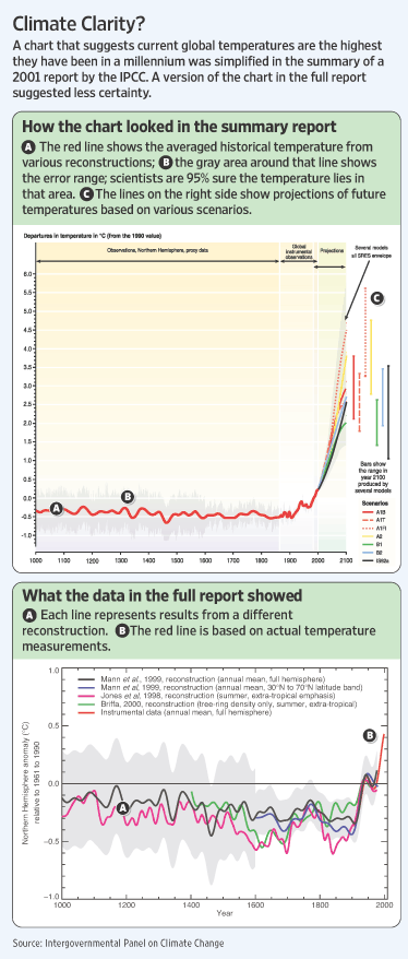
Hockey stick graph is on top; more accurate, but much less publicized graph, is on bottom. Source of graphs: online version of the WSJ article quoted and cited above.